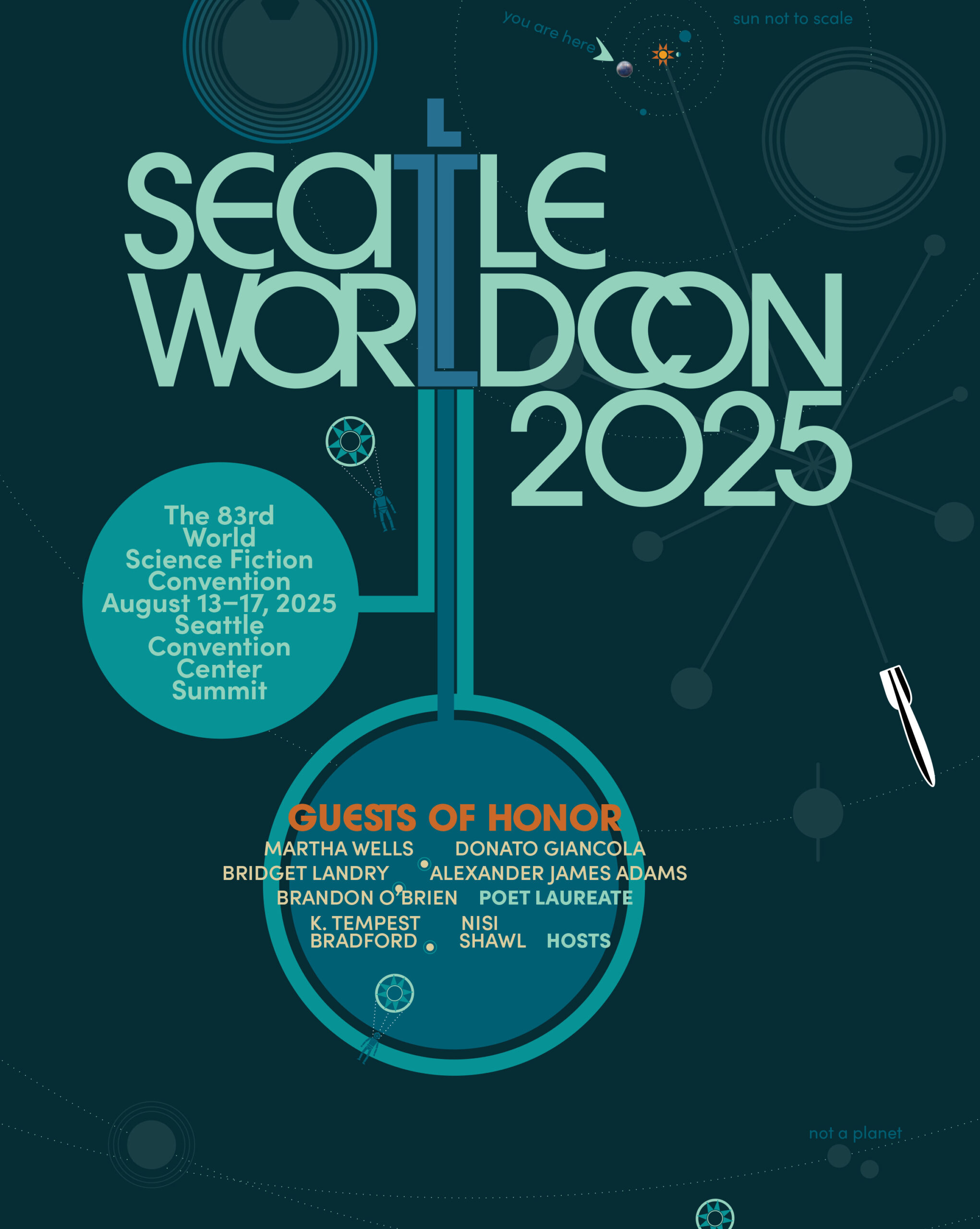
In 2025 Worldcon returned to Seattle for the first time since 1961. I was commissioned to design and typeset the souvenir book. I used elements from Seacon (the first Worldcon in Seattle), as well as the 1962 World’s Fair, to tie into their nostalgia theme.
This front piece was inspired by the 1962 Seattle World’s Fair, in both style and colors. By the way, the planets are in scale in both size and distance to each other. The Sun, obviously, is not.
Below are several more spreads.

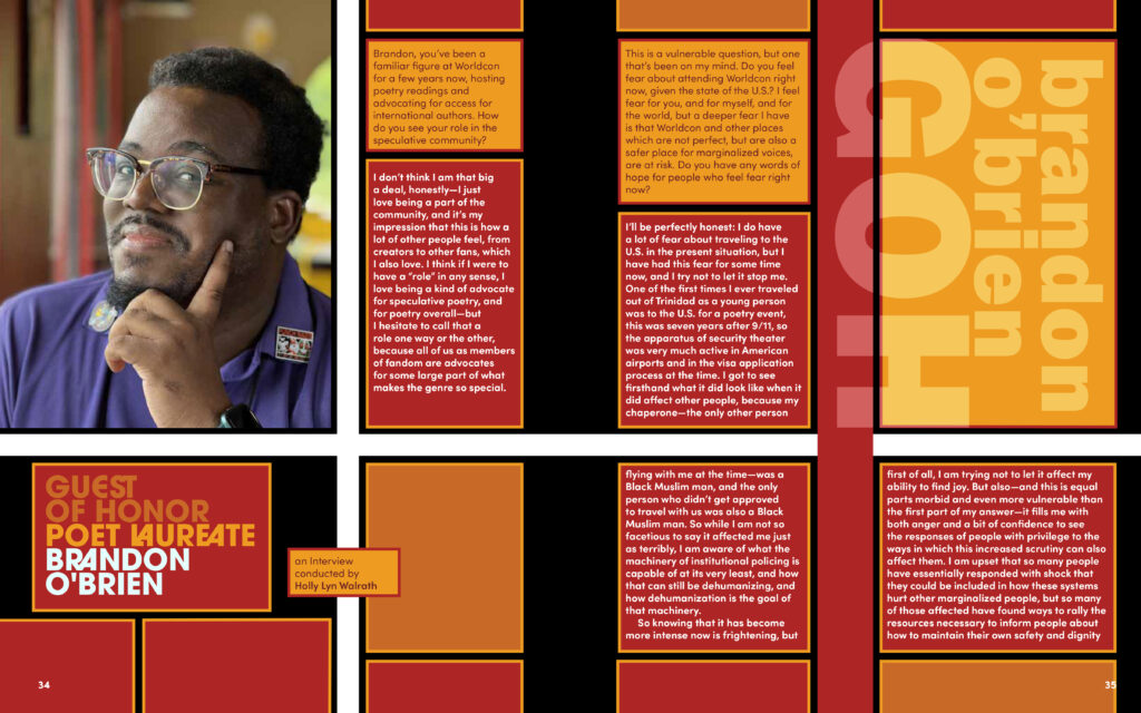

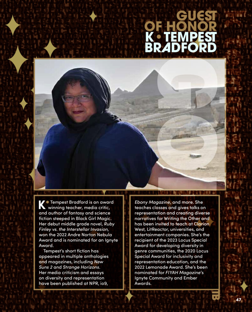

The uncovered texture used on Tempest’s spread.
It’s a play on her own logo graphics used on her website. I used text for the underlying texture. That’s right, the brown woven texture is all random, layered, letterforms.
Leave a Reply